Tim Hortons’ Rewards User Experience Enhancing 
This school project was inspired by my personal experience using the Tim Hortons app, where I found it difficult to activate offers and redeem coupons.
I started by identifying my own pain points, then conducted user research to gather broader insights.
The final solution is a redesigned offer activation and ordering system that improves speed, interface clarity, and overall usability—making it faster and easier for customers to access and use offers through the app.
Role
UI/UX Designer
Project Manager
Tools
Figma
Photoshop
Illustrator
Timeline
14 weeks

The main problem I addressed was the confusing and inefficient coupon redemption flow in the Tim Hortons app.
Users have to manually check which items are eligible, remember policy details, and switch between pages to build a valid order. This results in repeated back-and-forth navigation, decision overload, and wasted time, especially for first-time users or those in a rush.
Primary Research
I conducted primary research, including app reviews and an observation task. I analyzed user comments from multiple app stores to understand what people liked and disliked about the Tim Hortons app. I also observed customers at the Tim Hortons on my college campus—watching how they placed mobile orders, recording time clips, and interviewing them about their experience with the app.

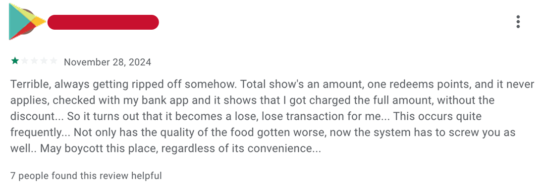
"There is no guidance after activating a coupon."
"There is no guidance after activating a coupon."
"The app doesn’t tell me I can’t use more than one coupon."
"The app doesn’t tell me I can’t use more than one coupon."
"The app doesn't visually provide more store location information."
"The app doesn't visually provide more store location information."


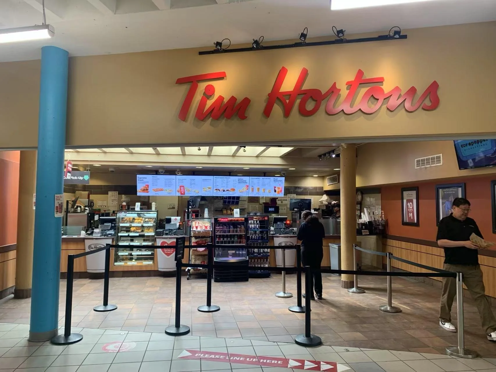
I conducted an observation at the Tim Hortons on my college campus to see how customers placed mobile orders. I also asked them questions about their experience with the app.
Key Problems Identified
1. Difficult Offer Activation
Users have to remember which items are eligible for each offer. Many forget the details and need to switch between screens repeatedly, which makes the process frustrating.

2. Confusing Redemption Process
On the redemption page, users must toggle a switch to use their points. If they don’t have enough points, the system quietly fails—even if the switch is still on. Users often don’t know how many points they have or what rewards are available, and the interface doesn’t help guide them clearly.
3. Poor Map Visualization
The app only shows a list of addresses in text form, without a visual map. This makes it harder for users to quickly find nearby store locations.
Secondary Research
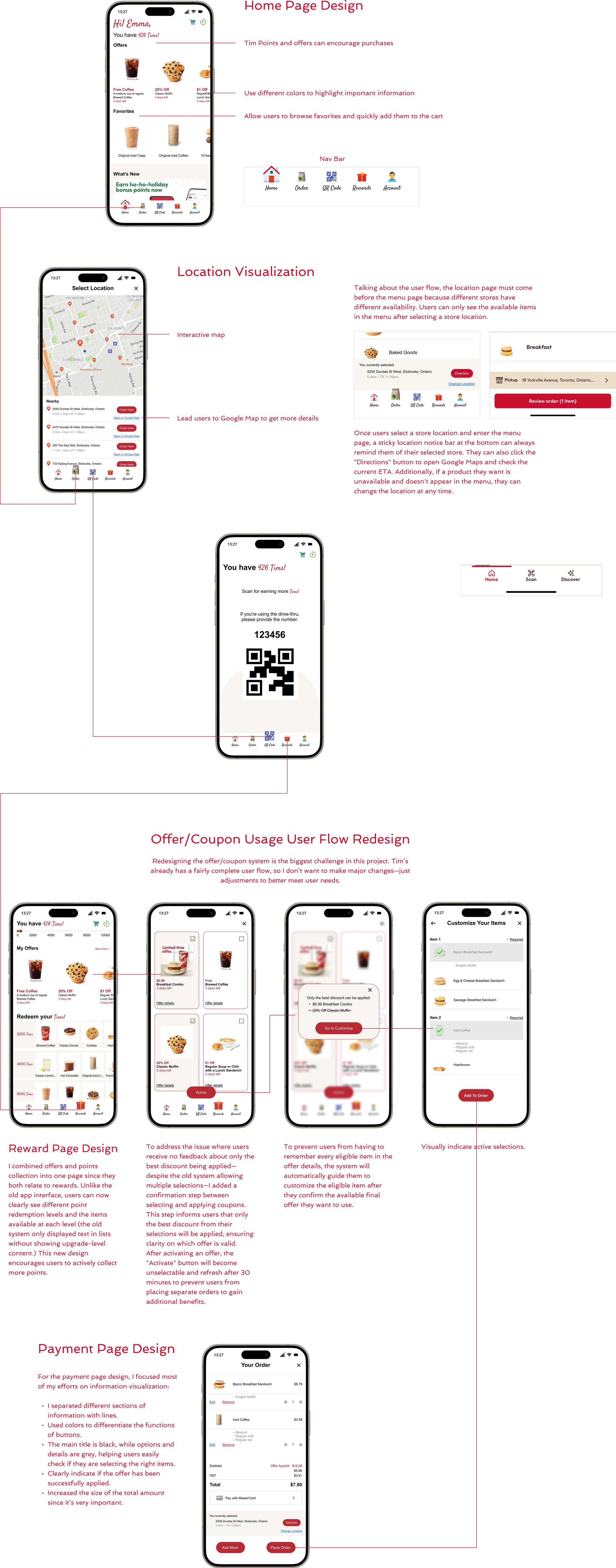
The insights I gathered so far came from different people’s perspectives through primary research. To make the analysis easier, I created a persona named Emma to bring together common features and behaviors in one user. It’s helpful to carefully consider Emma’s journey when placing a mobile order through the Tim Hortons app.
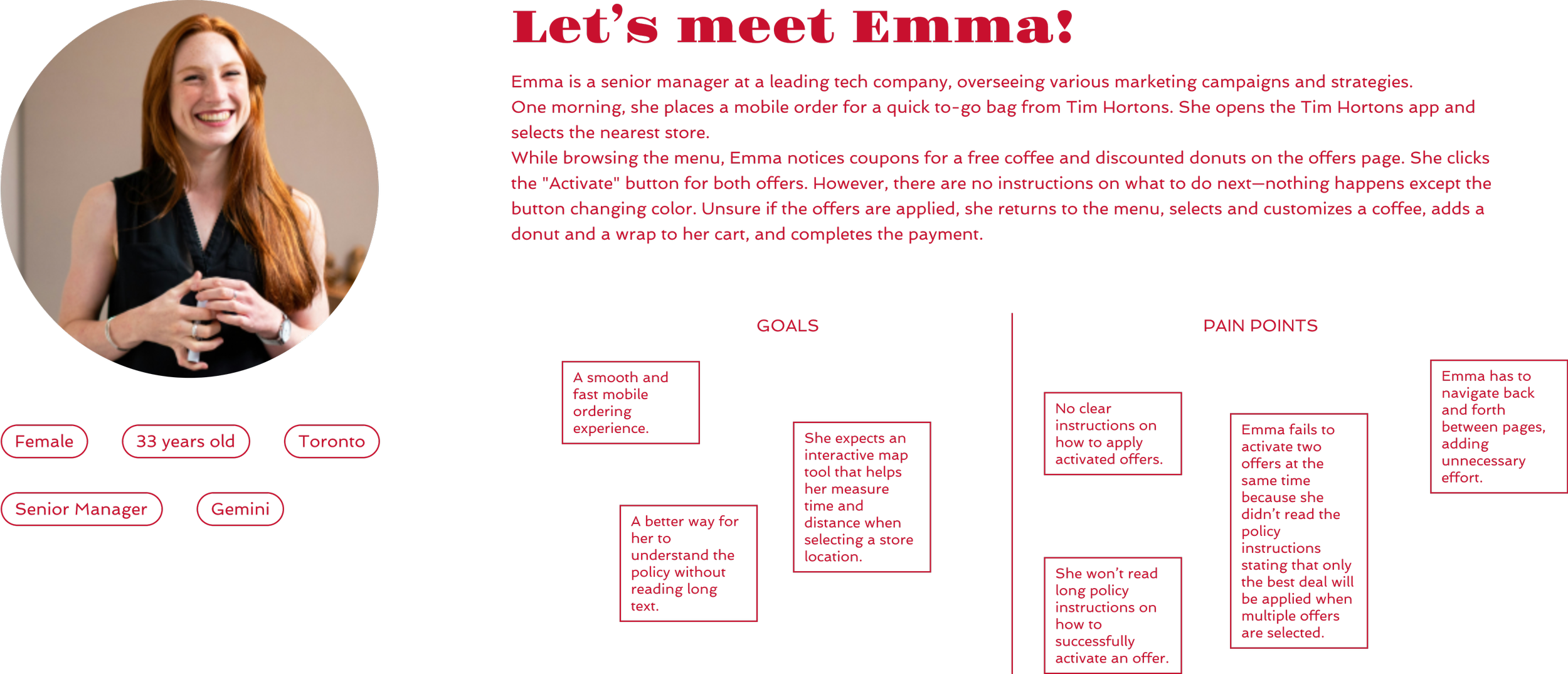
Emma’s Pain Points:
She had to open Google Maps to confirm the store location because the app’s text-only list wasn’t clear.
After pressing the activation button, she didn’t know what to do next.
She wasn’t interested in reading the detailed offer policy.
She wasn’t sure whether the bacon or sausage sandwich was eligible, so she kept switching between the offer page and the menu.
She felt it was a waste of time when some offers failed, especially after learning that only one offer can be active at a time, and the next one can’t be used until 30 minutes later.

Initial Concepts:
A more visual and interactive map
Helps users easily find nearby store locations with better geographic context.A guided order flow
The system can automatically lead users through each step of the mobile order process, reducing confusion.Offer policy notification
A clear pop-up or message to inform users about offer rules—such as activation limits and wait times—before they place an order.
Benchmarking Research

McDonald’s does a great job with its online food ordering system. It guides users step by step through customizing their orders, making the process simple and smooth. There’s a lot to learn from McDonald’s user flow to my design:


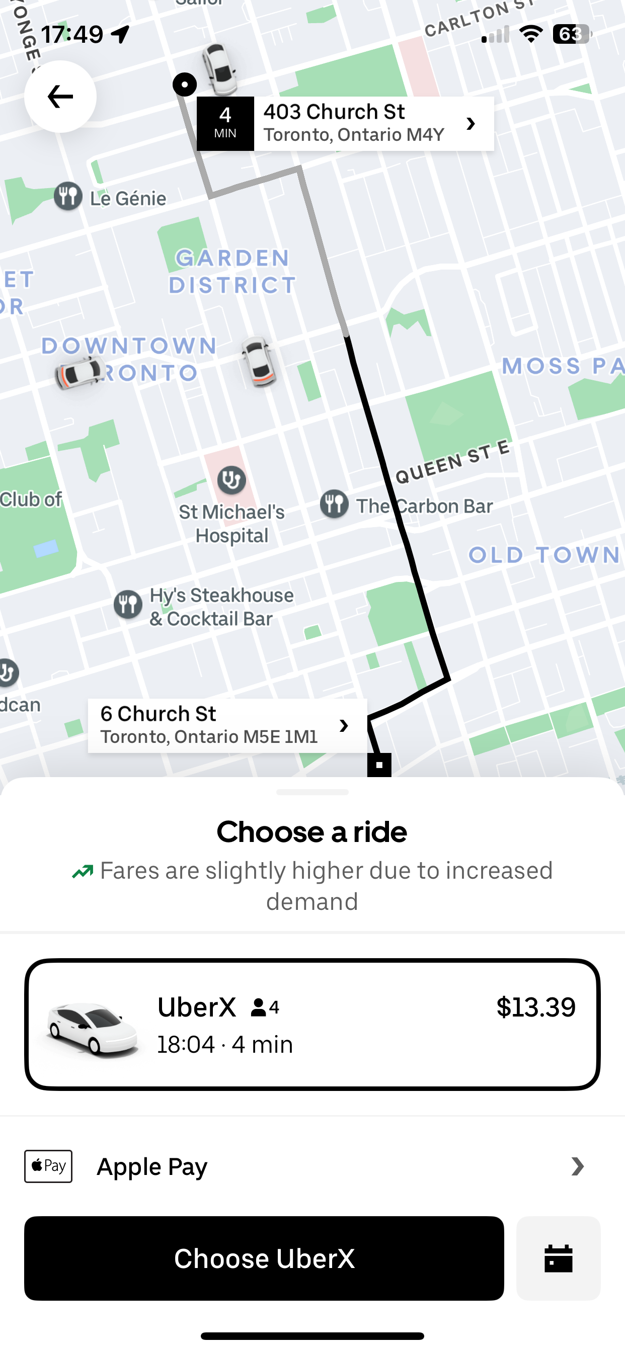
Learning from Google Maps and Uber with map interaction.
Real-Time Visuals: Maps respond instantly when users zoom, drag, or tap.
Useful Context: They show relevant info like traffic, nearby locations, or ride details.
Smart Predictions: The apps suggest destinations or routes based on user behavior.
Action-Oriented: Maps are directly linked to tasks like booking a ride or getting directions.
Smooth Experience: The entire flow feels quick, intuitive, and user-friendly.


Select an Offer — Pick an Item — Customize the Item — Pick Another Item (if the offer includes multiple choices) — Add to Order — Review Shopping Cart — Make the Payment
If users try to select another offer — the system would show a notification: “Only the best offer will be applied. Once selected, offers can’t be changed for the next 30 minutes.”
Design
Most designs are improved through iterative A/B testing.
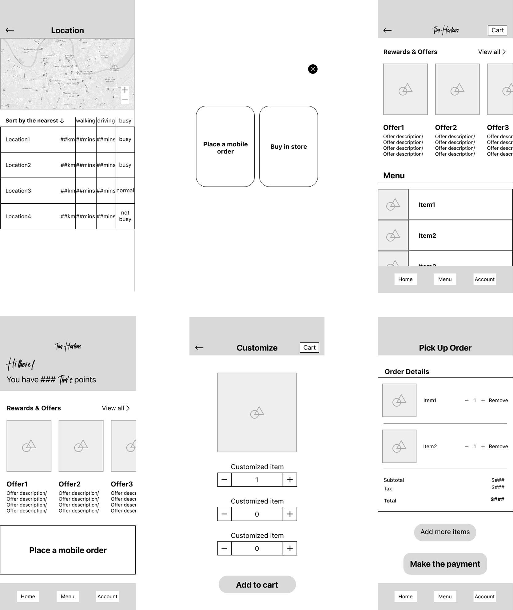
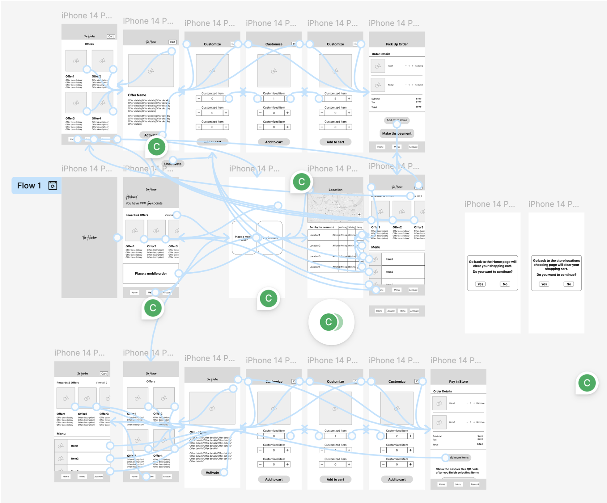
Lo-fi Wireframes
Built new basic frameworks based on user pain points.

Key Challenge
The key challenge was organizing the new user flow within Tim Hortons' existing app structure.
Since I didn’t want to redesign the entire system, I focused on reorganizing the offer feature by creating an auto-apply and customize flow. My goal was to make the new feature fit smoothly into the current design.
To do this, I used a user flow matrix to lay out user actions and tasks in a logical order, attached relevant screens to each step, and tested the flow using Figma.

Mid-fi Wireframes
I conducted a design system and color study to ensure my design stayed consistent with Tim Hortons’ brand language, so it wouldn’t feel like a completely different product.
Final Presentation
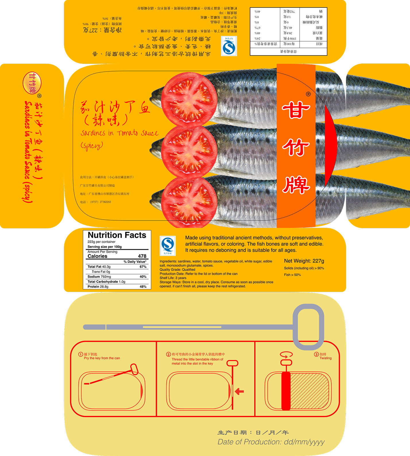
Ganzhu Tinned Fish Package Redesign

Perfects.AI Design System Construction
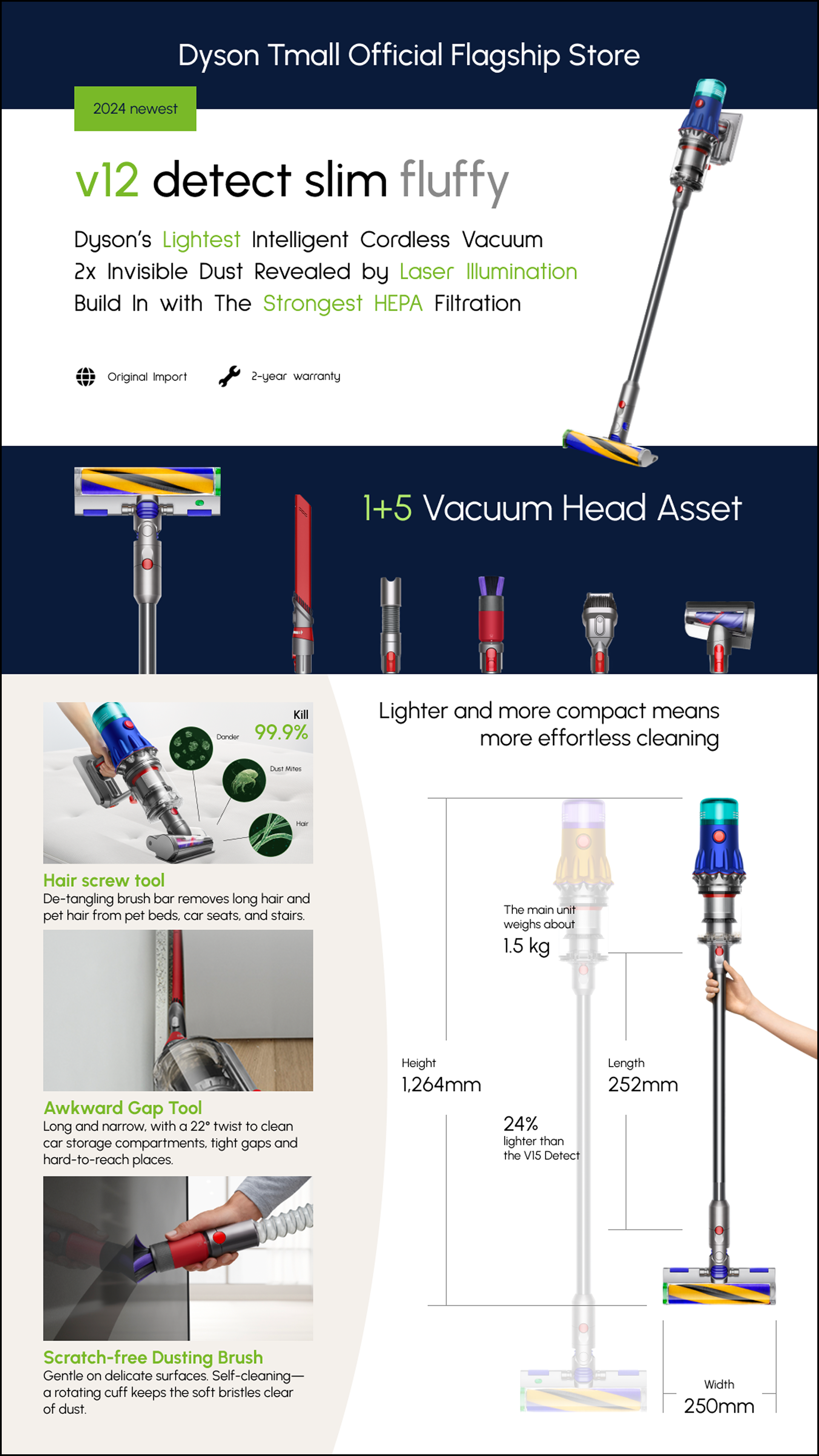
Dyson v12 detect slim fluffy (2024 newest) Infographic Design